The Right Control
Oct 12, 2021 • 2 min read
Forms design is one of the most difficult tasks every designer could face to. Fields alignment, errors handling and choosing the right control are the trickier part of the work. In particular, dealing with radio buttons.
Let’s see some cases where using an alternative to them works better.
1. Recommend a single best option
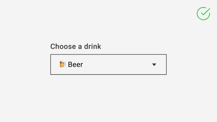
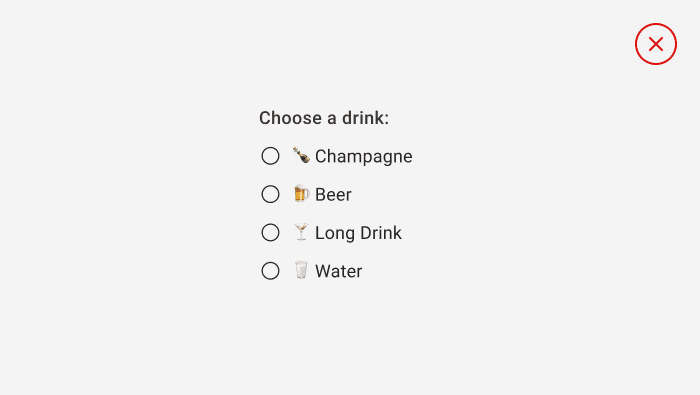 The most frequent case. Instead of a list of radio buttons use a combo box (or dropdown) to display that best option as the default:
Use radio buttons when users need to see all options before they make a selection. Unless all options deserve equal attention, consider using other controls
2. Only Two Possible Options
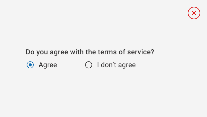
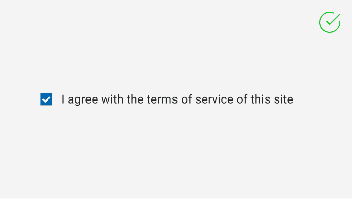
If there are only two possible options that can be expressed clearly as a single binary choice, such as on/off or yes/no, combine them into a single check box or toggle switch control. For example, use a single check box for “I agree” instead of two radio buttons for “I agree” and “I don’t agree.”
3. Multiple Options
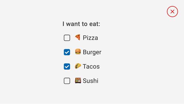
When users can select multiple options, use checkboxes
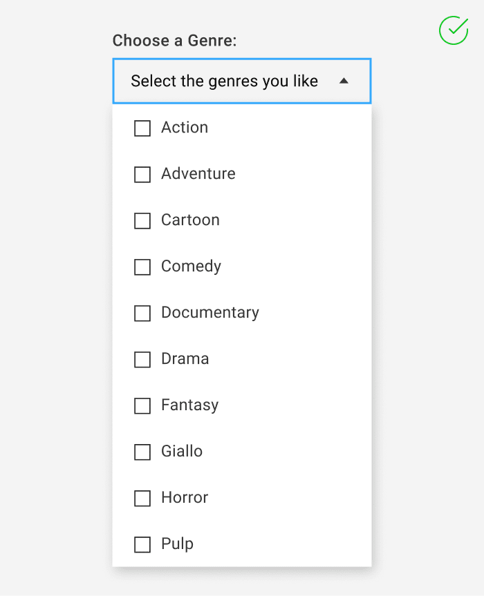
If there are more than eight options, use a combo box together with checkboxes.
When users’ options lie within a range of values (for example, 10, 20, 30, … 100), use a slider control.
Recommendations
- Make sure that the purpose and current state of a set of radio buttons is explicit.
- Limit the radio button’s text label to a single line.
- If the text label is dynamic, consider how the button will automatically resize and what will happen to any visuals around it.
- Don’t put two options groups side by side: it can be difficult for users to determine which buttons belong to which group.
Get new articles in your inbox - subscribe to my newsletter
