Better Modal Dialog Design In 4 Steps
Oct 21, 2021 • 3 min read
Modal dialog has become a very common component thanks to the spread of libraries/frameworks such as jQueryUI, Bootstrap, Foundation and so on.
It’s de facto one of the most used components on the web. For this reason, however, it’s often improperly used. Do you know the hateful newsletter subscription dialogs?

To correctly use the modal dialog it’s important to follow these four simple rules:
1. Use the modal dialog only for important actions
Important actions are those that require a greater cognitive effort from the user such as:
- files or documents upload
- payment checkouts
- account signup
- saving important informations
Instead, we can avoid using modal dialogs for all those contents that require more space and visibility - such as tables, infographics, wizard steps - which distract the user from what he was doing.
System Messages
If, on the other hand, you need to show an error, warning or success message, it’s advisable to use a component such as the message alert instead of modal dialog.
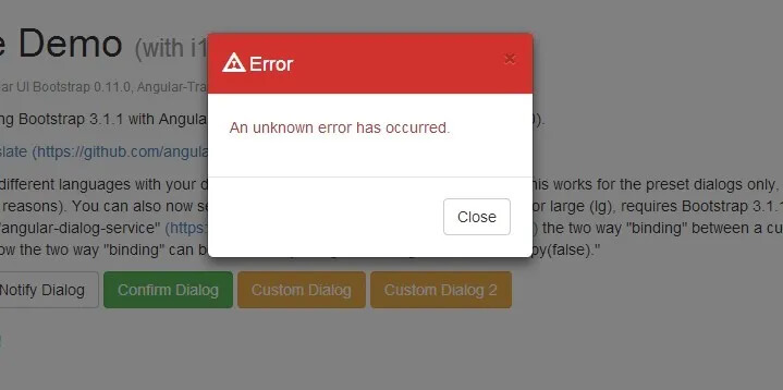 Example of modal error message. Image by angularscript
2. Let The User To Go Back
The user must be able go back to the where he was at anytime
The best position for the “Back” / “Cancel” action is on the left side of the modal.
Sometimes there may be other elements in the UI so the position of the “Back” / “Cancel” can be at the left of the primary action.
No Back To Top
If the modal is opened through an action placed anywhere in a page, it is essential that, once closed, the user returns exactly to the starting point.
Modal Size and Overlay
The content underlying the dialog must be recognizable: the user must be aware of where it was left.
In reason of this, the size of modal window shouldn’t be too large — the modal window shouldn’t take the entire screen. Ideally, it shouldn’t take more than 25% of the screen for the overlay.
3. One Call To Action
The modal dialog should possibly contain a unique call to action. Otherwise, too many opions will increase the cognitive load and the chance of error.
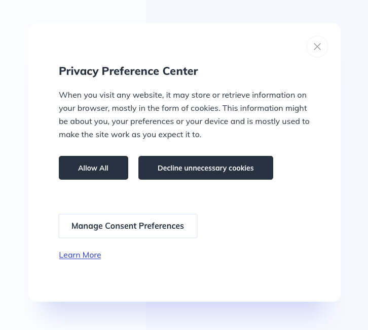
Cookie Preferences Modal UI Design by Ildiko Gaspar on Dribbble
In the screen above, the simultaneous presence of three call to actions, two of which have the same visual weight, makes difficult for the user to take the right choice in an appropriate time.
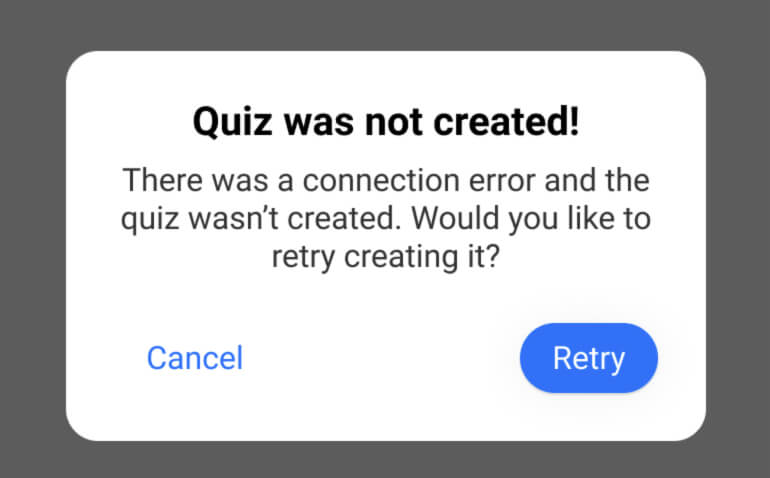
4. What To Do Should Be Clear
People may wonder why the modal dialog is displayed — especially when it is a system-initiated one.
Having a clear and descriptive message must explain the purpose of the window.
Users should be able to read the text and understand the message you are trying to communicate to them and the possible actions.
Lean more about this topic:
- Modal & Nonmodal Dialogs: When (& When Not) to Use Them - Nielsen Norman Group
- Best Practices For Modal Window Design - UX Planet on Medium
Receive an email whenever I publish a new article or post news about my work