How I use groups in Figma
Mar 14, 2023 • 2 min read

Keeping layers organized in a design tool is not easy. Sometimes, for the sake of speed, we forget how important it is to structure layout elements according to a logical order.
Working on web projects often, my advice is to think about the HTML structure of the layout and try to replicate it (as far as possible) in the organization of the layers.
Wrapper
Wrapper is the parent container for all child groups like Section, Container, and Group. It generally provides spacing between elements to make the space between sections uniform.
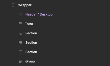
I apply a Layout Grid only if the space between the sections of the layout is uniform.
Container
Container is a generic group that I use to delimit the boundary of a grid.

For this reason, it always has an Auto Layout with lateral spacing, spacing between items, and layout grid applied.
I apply a fixed width only in the case of layouts for large devices (laptops, desktops, TVs, etc.).
Section
Section defines a specific section of the layout. It can be the central body, a sidebar, or a set of other elements.
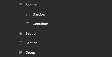
I apply lateral or item spacing based on the needs (e.g. the section has a background color and I want to create internal padding).
In some cases, it may include one or more ‘Containers’ (e.g. a full-page background color section).
Group
Group is the group that I try to use the least of all for its poor semantic meaning. But sometimes it may be necessary to put elements or components together for specific Auto Layout management.

Example: in a Card component, I define a different spacing between groups of elements that are inside it.
List
List is a group of elements that can be arranged either horizontally or vertically.
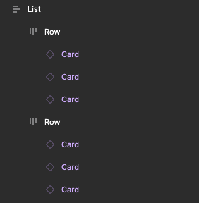
It can provide lateral spacing. It always provides spacing between the elements that are part of it.
Row
Row is a group that defines a section of the layout with a list of items arranged on the same row. It always belongs to ‘List’.
Receive an email whenever I publish a new article or post news about my work
