How to communicate visual hierarchy on wireframes
Dec 7, 2020 • 1 min read
Many designers think they need to use color on a wireframe to communicate hierarchy. If you’re doing so, you’re totally wrong. The use of color is the best way to add emphasis to a specific element on visual design. But on a wireframe, it’s the worst.
Color breaks conversation
Wireframes purpose is to keep focus on structure and hierarchy, excluding any visual discussion to a next phase. It’s function is to display necessary page elements in an orderly arrangement. Adding colors and visual details will break the conversation with stakeholders. You’ll find yourself discussing abount tint, shades or personal color preferences.
Alternatives to colors
The design should have a clear hierarchy without colors. You could include other visual elements to add hierarchy.
Size
 Using different sizes for blocks
The bigger an element is the more attention it’ll draw. Not every element should have the same size.
Placement and Space
 Add white space to separate content areas
Users scan a page in a particular pattern. You can place important content in high attention areas using space to separate those, driving attention to the relevant one.
Shapes
 Using different shapes to highlight content
You’re not limited to colors and size. If you want to highlight content on a page you could use shape. Rectangles, lines, rounded or squared shaped. Use anything you want to show that area is important.
Visual hierarchy without color
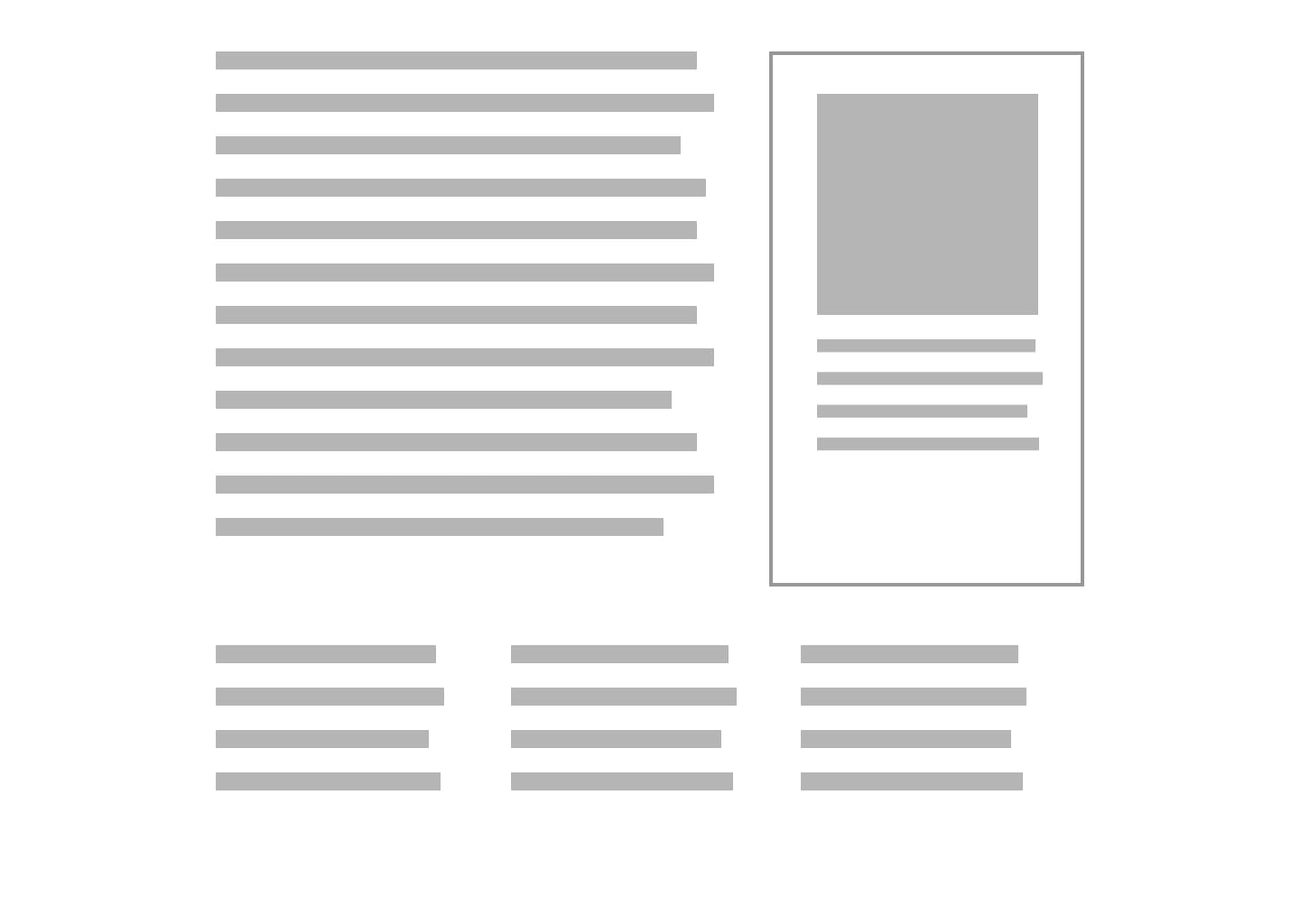
The best wireframe style is no style. Match form with function using a monochrome style — one color against white.
In a monochrome wireframe everything is equal weight. Users can focus on the whole user experience not arguing why something has a particular color. This will enable a right design conversation.
Receive an email whenever I publish a new article or post news about my work