Dark/Light Mode Toggle: a Usability Issue
Nov 26, 2020 • 2 min read
Most of the solutions adopted for the toggle light / dark mode suffer a usability problem. The status of the toggle does not represent the current one of the interface, visible by the user. Too much minimalism isn’t always a good solution in UI Design.
Approach 1: icon only
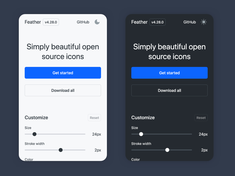
 Dark mode toggle on feathericons.com
Let’s take the toggle visible on the feathericons.com site as an example. The toggle is located in the top-right positon of the screen. In light mode the user sees the moon icon, in dark mode that of the sun. The two symbols are used in an exclusive and inconsistent way because they do not represent the interface current state.
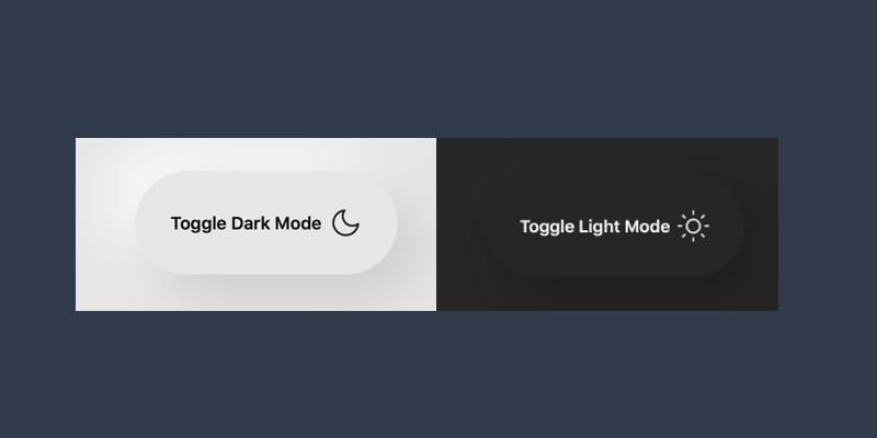
Approach 2: icon and label

Similar to the previous approach but with the addition of a label. However, I get confused by seeing the “dark” word and the moon icon on a white background. The same happens for “light” and sun.
Visibility of system status
Norman’s first usability heuristic reminds us of what is really important in user interface design:
Communicating the current state allows users to feel in control of the system
An interface should always keep users informed of what’s happening, through appropriate feedback. Only in this way can the user feel in control of it.
Solution: be coherent
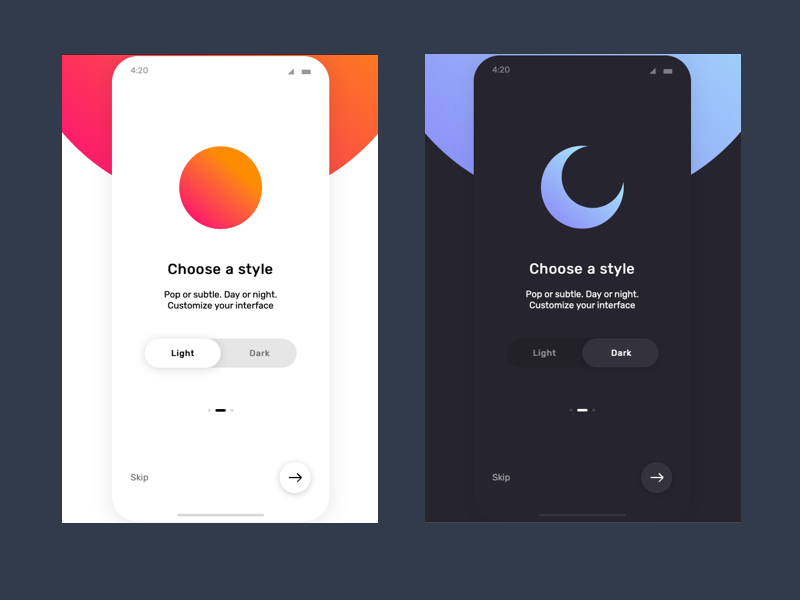
 Pure CSS dark mode toggle switcher - by Demilade Olaleye
A good solution is also the simplest one. The two options are both visible, in the example with a label but it can also be just an icon. The selected option coincides with the current state of the system and is highlighted.
See this demo on CodePen.
System prefences
Since both Windows/Mac OS have introduced the ability to choose between light and dark mode at the system level, many sites have added this feature to their design without informing the user. Probably you land to a website and see it in dark mode without choose.
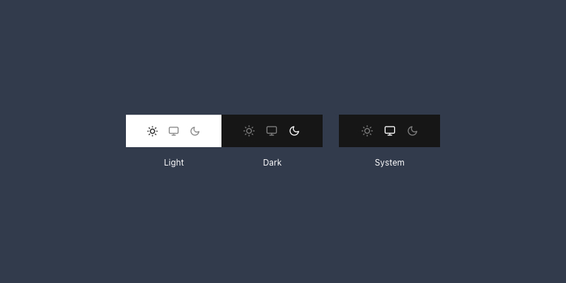
 Possibile solution with three options
A better solution provide a third “system” option, in this example represented with a monitor icon.
In conclusion
Only by knowing what the current system status is can you change it
A lack of information implies a lack of control. It’s a common usability rule that we could find applied to many objects that surround us in the physical world. As designers of digital products, we just have to remember to use it.
Receive an email whenever I publish a new article or post news about my work
