Design System .italia
The official design system for the Italian public administration digital services.
Context
Italy's public administration is a complex ecosystem — thousands of institutions, each with different budgets, technical capabilities, and design maturity. The goal of Design System Italia was to provide a shared foundation that any public body could adopt, from a small municipality to a national ministry.
Challenge
The challenge wasn't purely technical. It required balancing the needs of highly diverse stakeholders, ensuring that components worked for both small teams with no design resources and large agencies with established processes.
Responsibilities
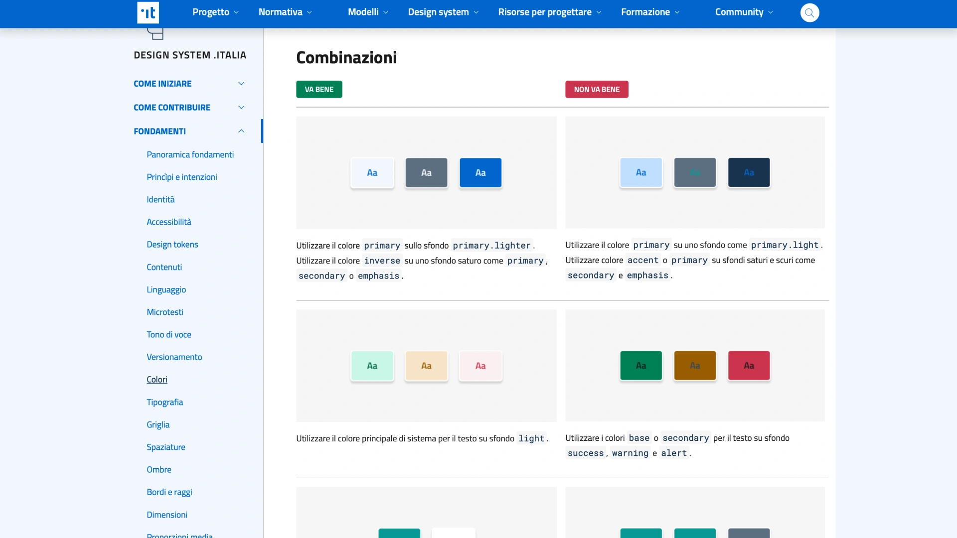
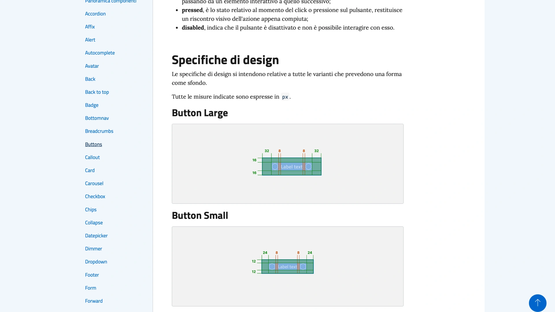
Authored all component documentation and usage guidelines
Defined interaction patterns and guidelines for each component
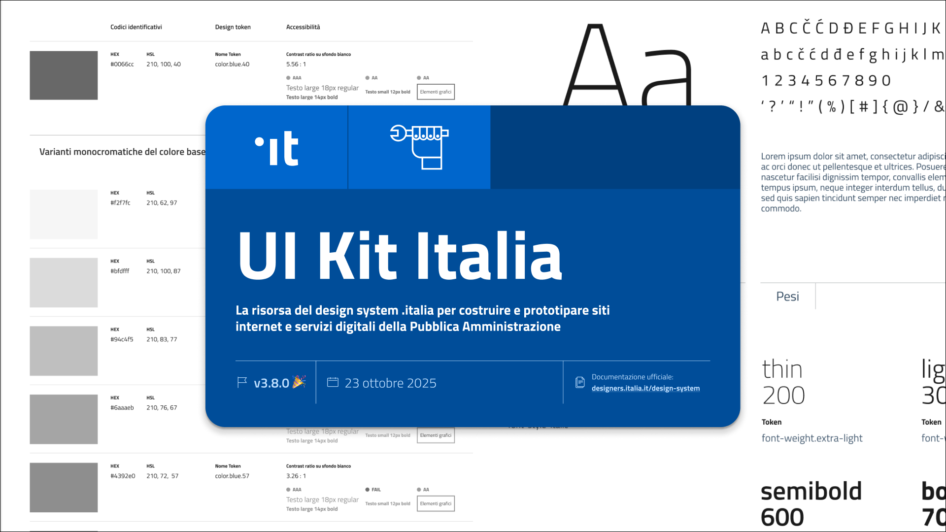
Managing the Figma component library (UI Kit Italia)
Coordinated with front-end developers to ensure implementation consistency
Ensured accessibility compliance (WCAG 2.1 AA)
Reviewed community contributions and governed design decisions in public on GitHub
Project gallery
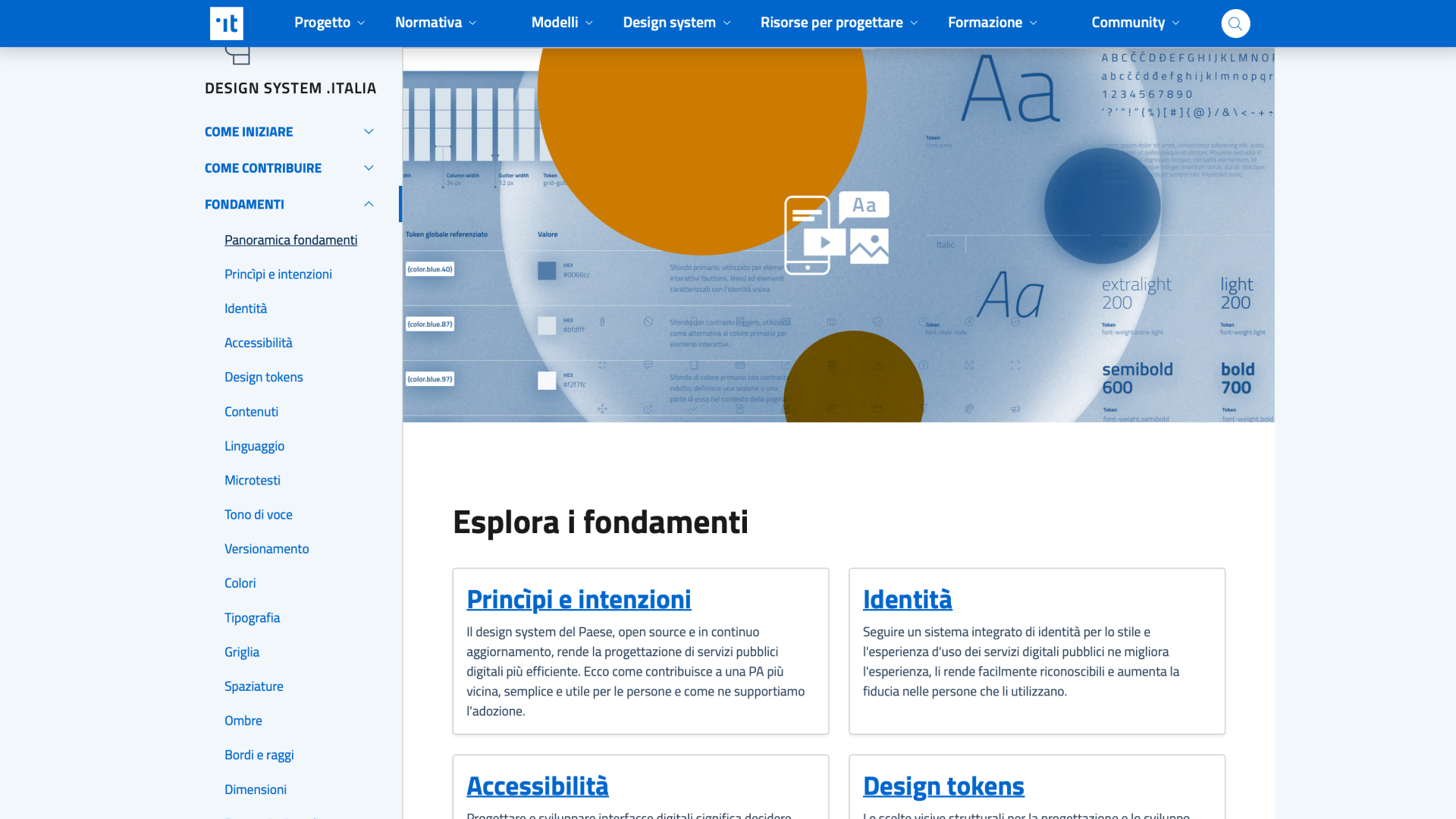
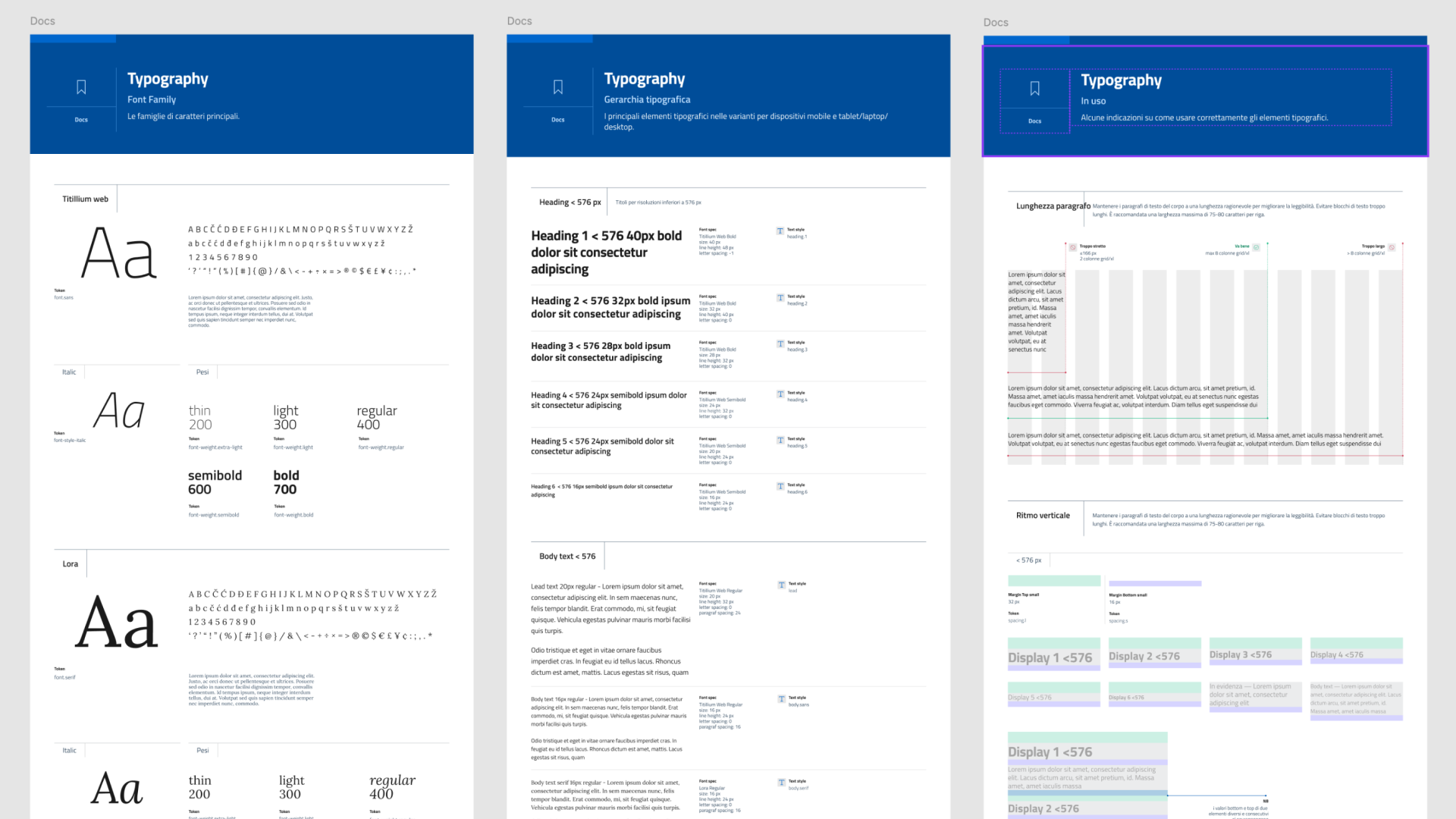
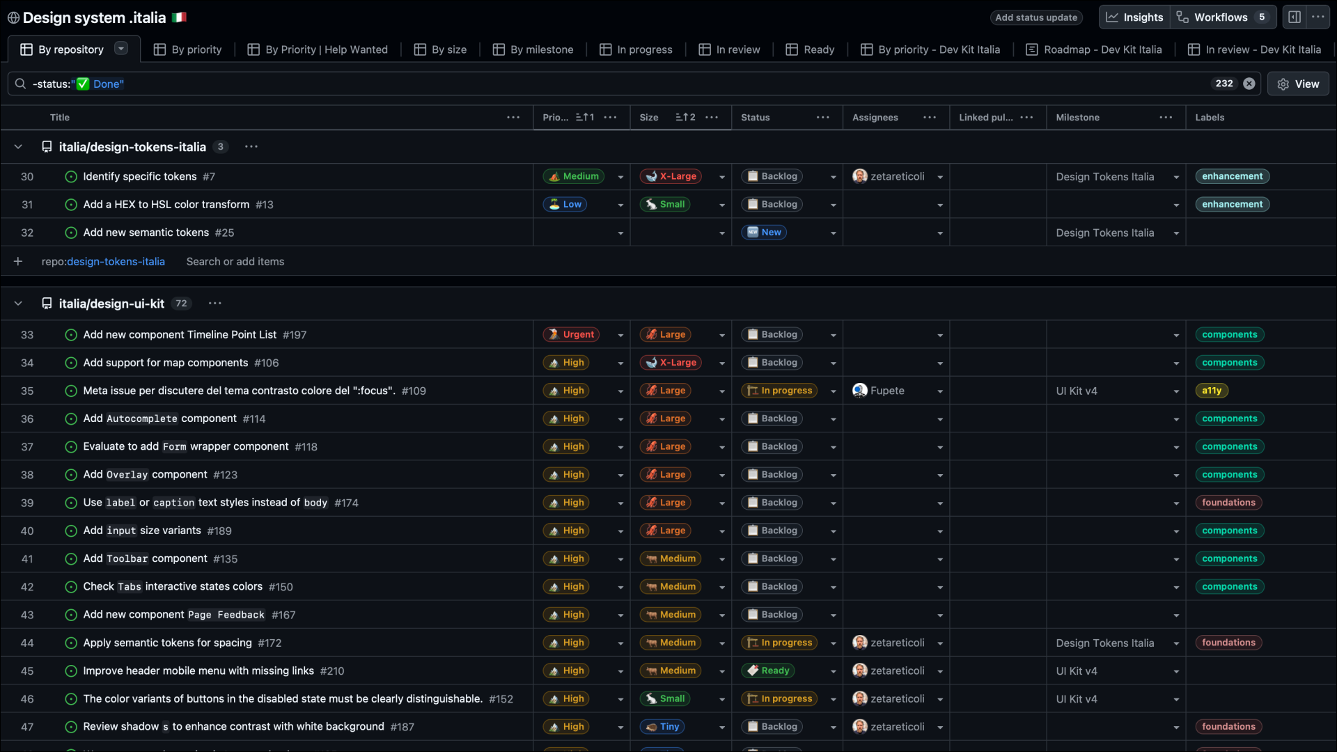
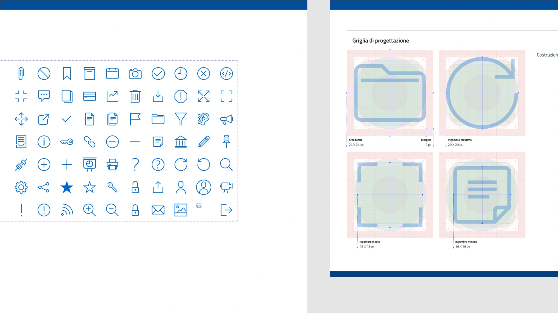
Full Story
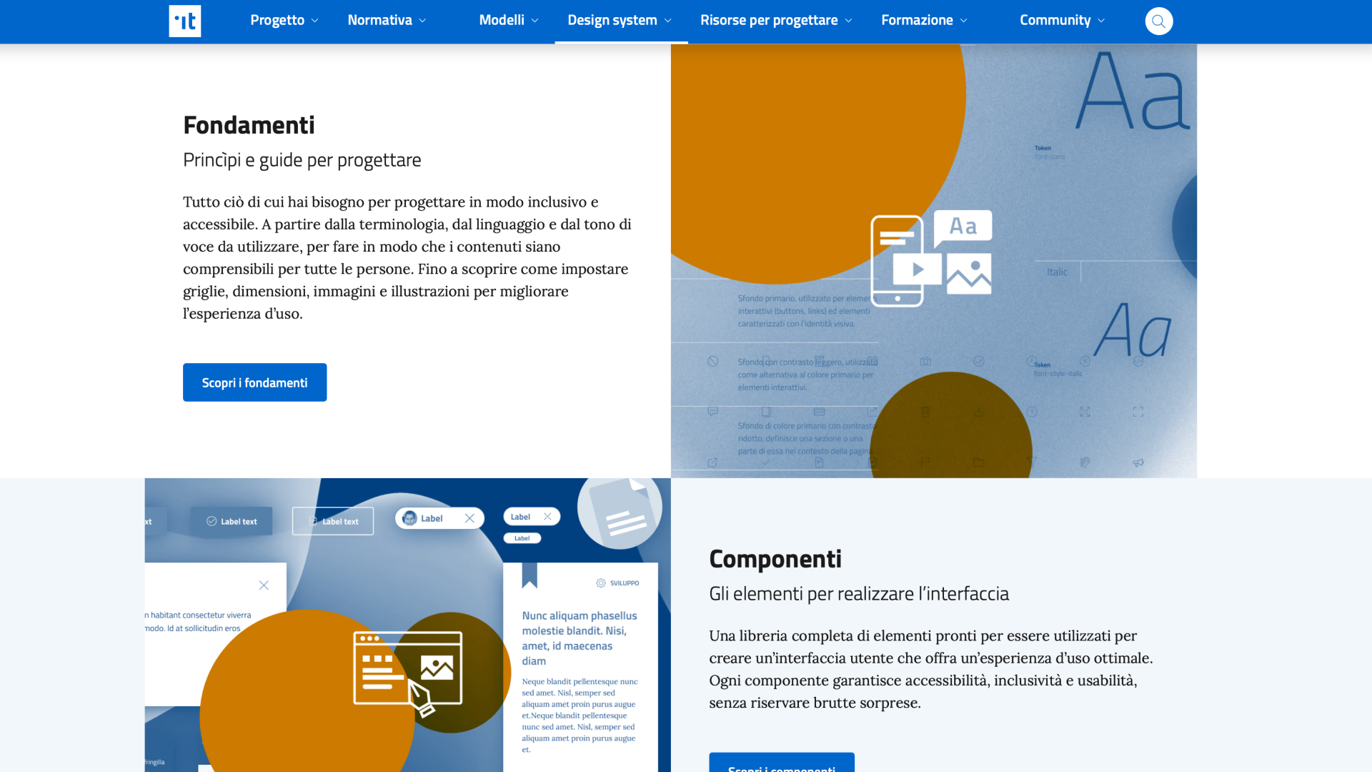
Design System Italia is an open-source design system for Italian public services that provides guidelines, tools and resources so thousands of teams can build consistent, compliant interfaces. I curated all of them, keeping in sync, coordinating the work, and reviewing and community contributions in public on GitHub.
Authoring the system
I authored all component documentation and usage guidelines and defined the interaction patterns for each component: how it changes state, behaves, and supports people navigating with a keyboard or screen reader. This work rarely shows up in a component library screenshot, but it’s what enabled fifteen thousand teams to build consistent interfaces without needing to ask me directly.
Managing the Figma component library
I directly curated UI Kit Italia, the Figma component library keeping it mirrored token-for-token and state-for-state against the coded components. Keeping those two sources of truth in sync across every release was a constant, low-visibility maintenance job that nobody notices until it breaks.
Ensuring implementation consistency
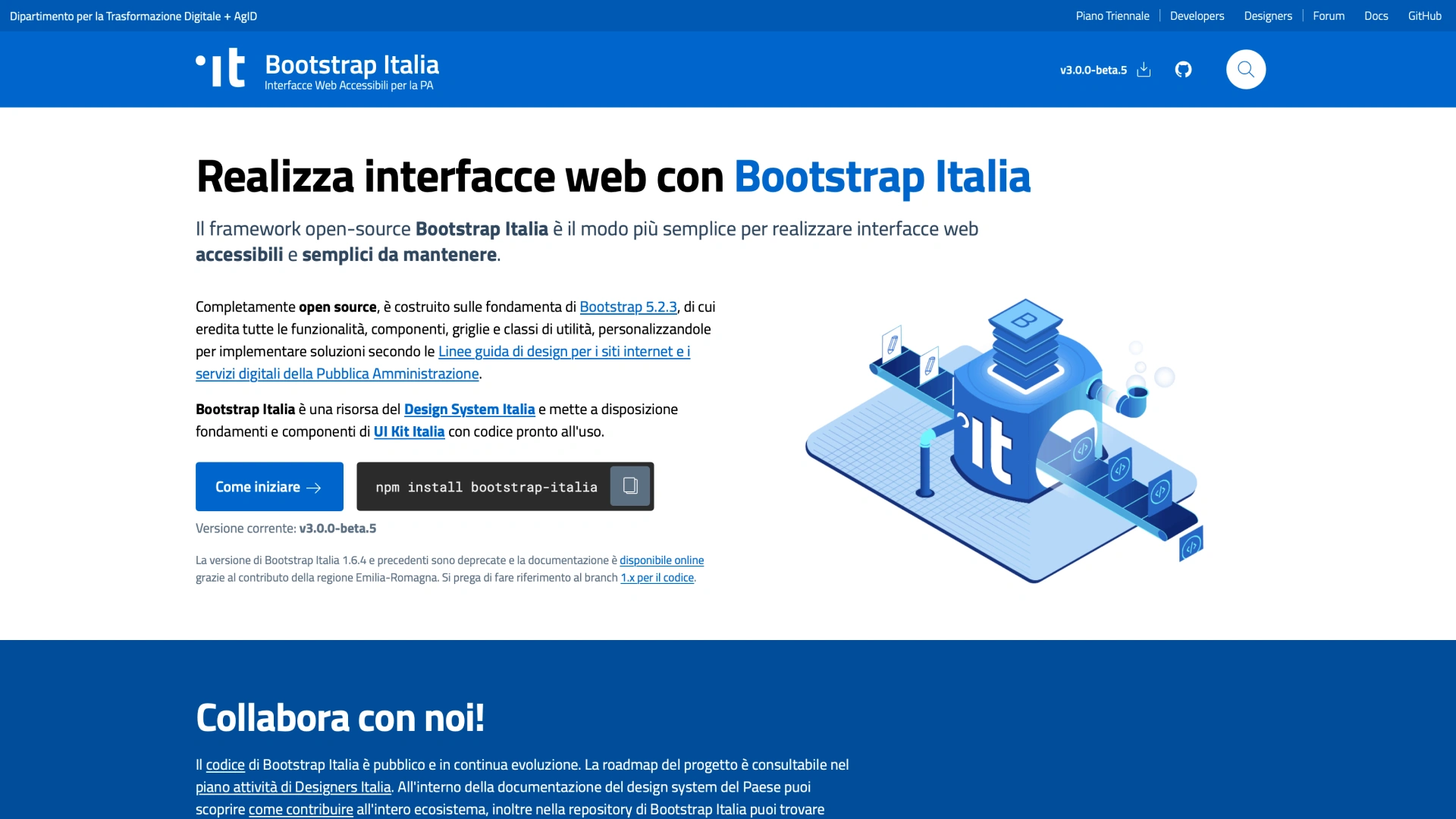
Bootstrap Italia is the coded front-end framework that turns the system’s tokens, elements and interaction patterns into production-ready components.
Across the v2.x line and in v3.0.0, I translated design decisions into implementation requirements for the development team and worked directly on the HTML and CSS across foundations and components.
I wrote the interaction specification for every new or revised component, reviewed incoming pull requests against those specs before merge, and worked directly with the front-end developers to close the gaps between what a component looked like in Figma and what it had to do in the browser.
The new v3.0.0 rewrite meant re-verifying the entire component set against WCAG 2.1 AA as the underlying markup and CSS architecture changed, and defining a migration path so the fifteen thousand sites already built on v2.x wouldn’t break on upgrade.
Design Tokens Italia
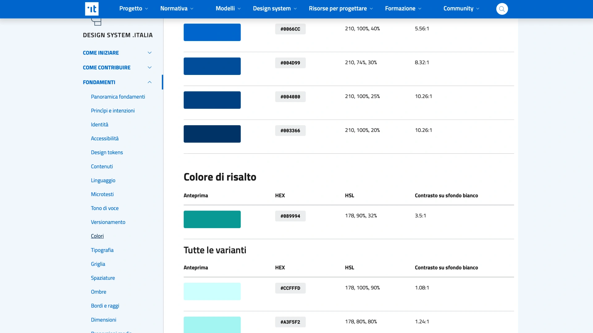
Design Tokens Italia is where every colour, spacing value, and typographic scale in the system lives as a single source of truth, and I own that architecture end to end. I define and maintain the tokens as JSON files in a public repository, structured so that a change to a core value — a brand colour, a base spacing unit — propagates automatically to every platform that consumes it, rather than being hand-edited in a dozen places.
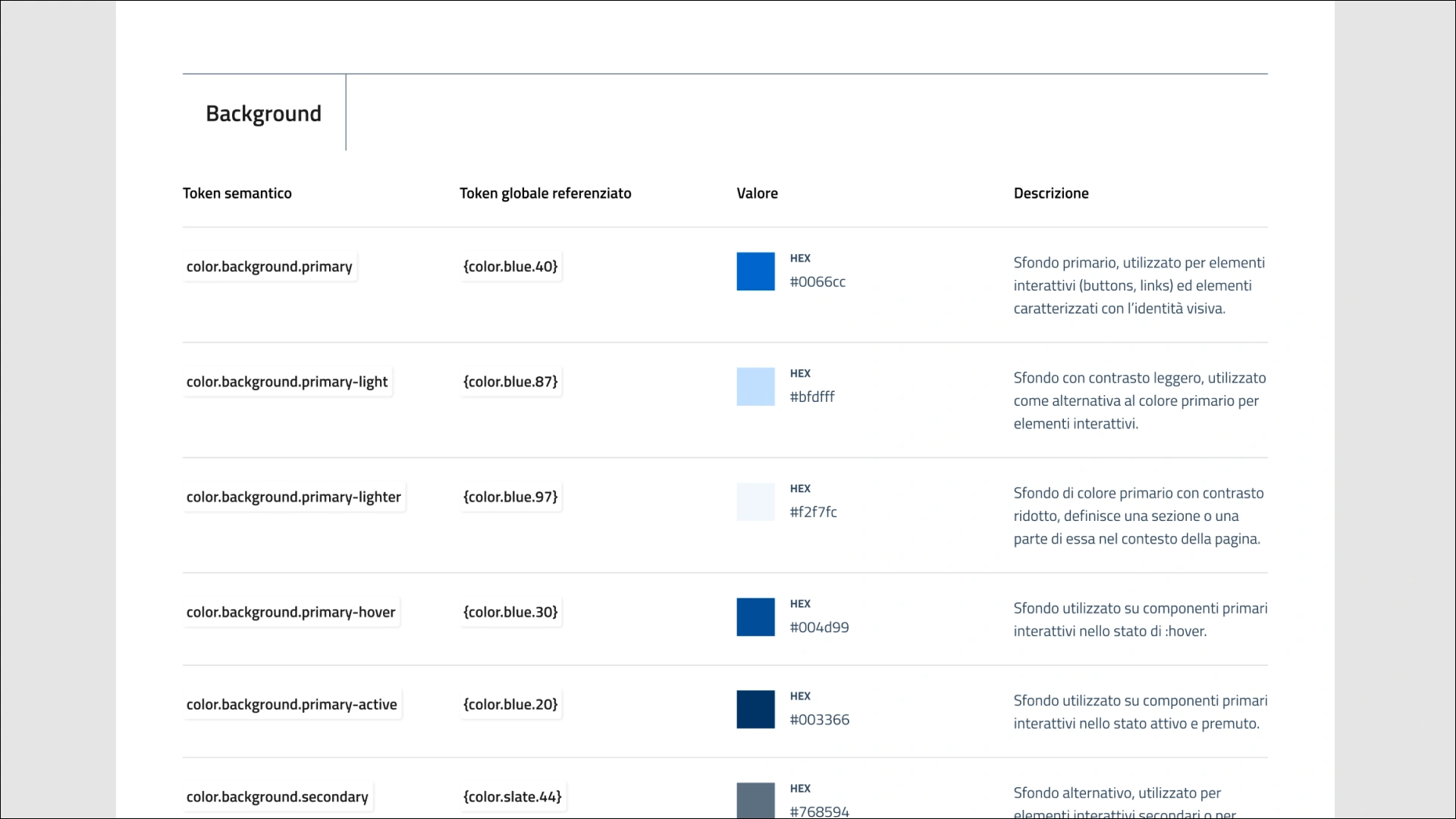
I set up the Style Dictionary pipeline that transforms those JSON definitions into the CSS variables Bootstrap Italia and Dev Kit Italia actually ship, wired into continuous integration so a token change is validated and published the same way as any other code change, not passed along informally to whoever remembers to update it. On the design side, I maintain the equivalent token set in Figma Tokens Studio, so designers work against the same values developers build against.
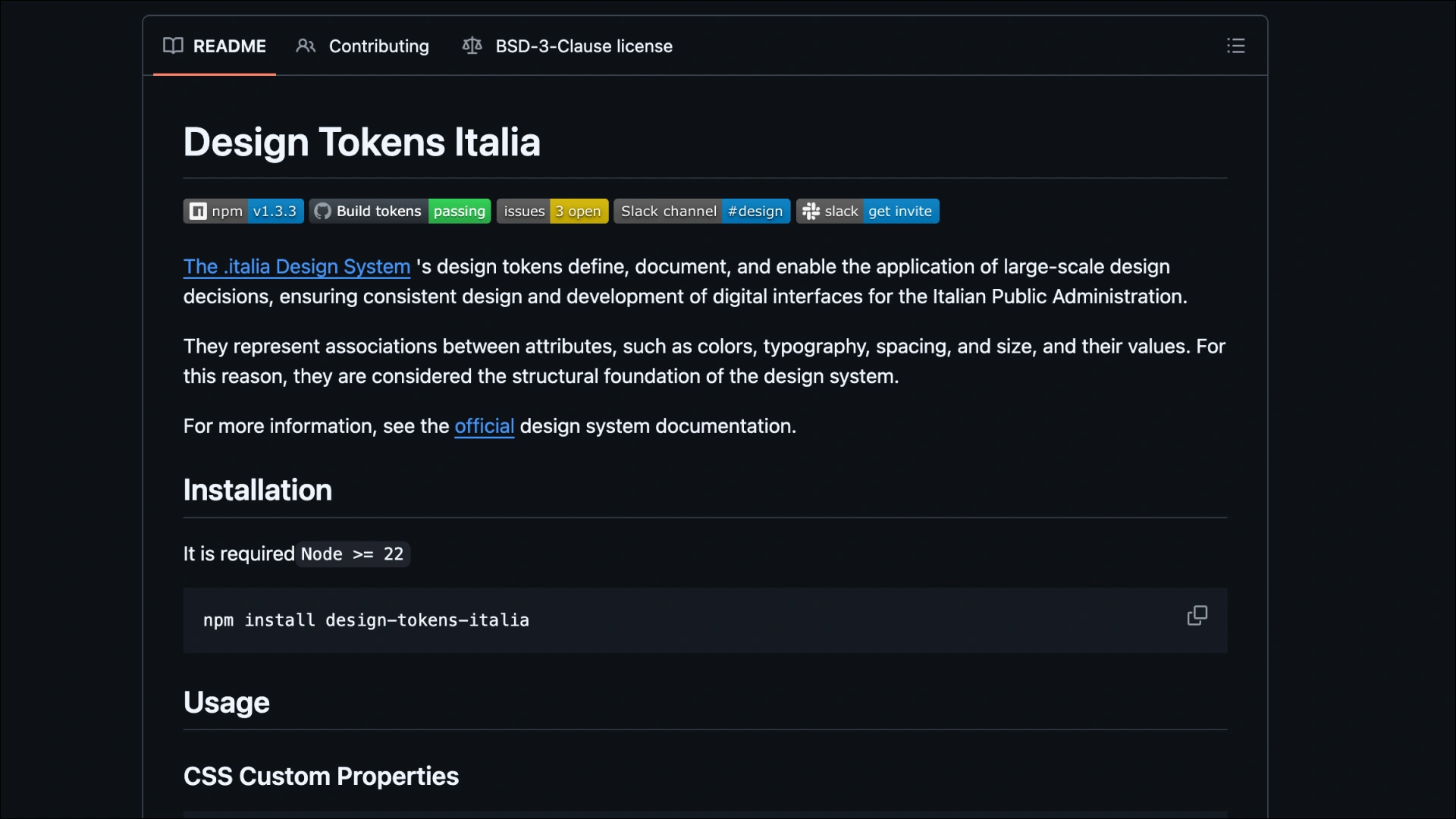
Keeping that pipeline reliable, rather than just defining the tokens once, is most of the actual work: reviewing every proposed token change for downstream impact before it merges, and making sure the public repository stays legible to contributors who only ever touch it once.
Consistency and flexibility
The design system had to work for everyone from small municipalities to large ministries, all under the same accessibility rules and expectations of public-service clarity.
The constant pull was toward exceptions — custom colours, layout variants, institution-specific themes. Each made sense alone; together they would have turned the system into a theme kit.
So I kept the flexibility surface intentionally small (spacing scale and a limited set of semantic colour tokens) and documented “no” decisions to vendors and stakeholders, translating constraints into clear, actionable guidance.
Working in the open
Design System Italia is fully open source on GitHub. For most of the project, I helped set the rules for working in the open: what we documented, how we explained trade-offs, and which community pull requests we merged.
Most decisions (states, naming, tokens) happened in public. At first it slowed me down, but it became a strong quality check.
Reviewing first-time contributors showed me where the docs were unclear. I wrote clear rationale in commits and PR reviews, replied to issues from small teams, and explained choices in plain language. Many of those conversations became documentation.
Community Workshops
Community Lab were a series of workshops designed to help public administration teams adopt the design system. They were a chance to learn about the design system, get hands-on with the components, and get feedback on their implementations.
Outcomes
Public administration adopting the design system across Italy
Components in the design system
Different resources available to the community
Award won for UI Kit Italia