The right colors for calendar events
Feb 17, 2023 • 2 min read

Choosing the right colors for your calendar events is an important aspect of week planning and prioritization.
When you’re juggling multiple tasks and appointments, a well-organized and color-coded calendar can make all the difference in keeping you on track and ensuring that you don’t miss any important deadlines or appointments.
There are several reasons why choosing the right colors for your calendar events is important.
Firstly, it allows you to quickly and easily distinguish between different types of events. This can be particularly helpful when you have a busy week ahead, and need to quickly scan your calendar to see what’s coming up. By assigning a different color to each type of event, you can easily identify what you need to focus on and what can wait.
Secondly, color-coding your calendar can help you prioritize your tasks and appointments. For example, if you assign the color orange to important meetings that you can’t miss, you’ll be more likely to prioritize these over less important tasks. This can help you to stay focused on what really matters, and avoid getting sidetracked by less important tasks.
So, what are some good colors to use for different types of events?
Blue
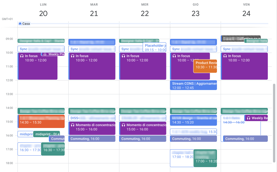
Blue is a great color for meeting invites from external people. It’s un-obtrusive and doesn’t draw too much attention. It’s the default color on Google Calendar.
Orange
Orange is a bold and attention-grabbing color that will ensure you don’t miss it. It perfectly works for any event you wan’t miss, like important meetings or tasks.
Purple
Purple is a good color for focus moments because it’s a calming color that can help you stay focused and avoid distractions.
Teal
I use teal for all recurring events, like stand-up or weekly meetings. It’s a distinctive color that will help you easily identify events that happen on a regular basis.
A balanced palette
When choosing colors for your calendar events, it’s important to create a balanced palette with the right contrast between different types of events.
Here it’s a sneak peek of my calendar applying the suggested colors:

You don’t want all of your events to be the same color, as this will make it difficult to distinguish between them.
Instead, aim for a palette of 3–5 colors that provide a good balance of contrast and complement each other well.
In conclusion
Choosing the right colors for your calendar events is an important aspect of week planning and prioritization.
By assigning a different color to each type of event, you can prioritize your time more effectively, and ensure that you don’t miss any important deadlines or appointments.
So, take some time to carefully choose your colors, and enjoy a more organized and productive week ahead!
Receive an email whenever I publish a new article or post news about my work
