Brutalism Web Design
Jan 18, 2022 • 1 min read
In the era of Design Systems, where consistency, coherence and uniformity are the masters, it’s quite impressive (and nice) to see a new trend emerge, the Brutalism Web Design.
Origins
Brutalism is an architectural style that became popular in the 1950s and up to the 1980s. The term derives from the french phrase “béton brut” which means “rough concrete”.
In particular, institutional or civic buildings adopted this style. These were seen by most people as very hostile, ugly and intimidating.
A new trend?
Yes, but what does web design have to do with it?
The reason why this style of web design takes its name from the architectural one lies in the same emotions it evokes.
Furthermore, the strange appearance of these websites is also attributed to a willingness to differentiate themselves from the global standard. Today, websites look all the same.
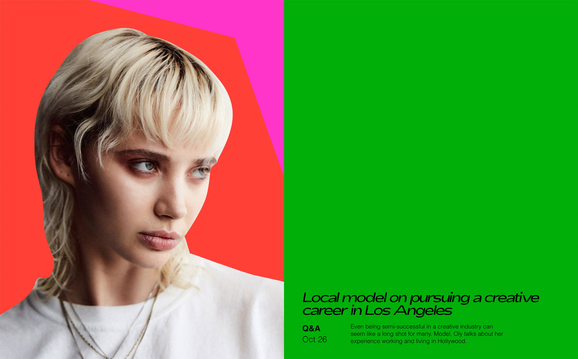
Let’s see some characteristics of a “brutalist” website:
- Black or white backgrounds
- No gradient or shadow
- Overlapping elements
- Lack of symmetry
- Crowded design
- No distinct hierarchy
- Monospaced typography
- One font used throughout
- Colors with strong contrast
- No animation
- Scattered images
- Simple or non-existent navigation
- One page layout
If you’re curious about this visual trend, you can take a look to these collections:
brutalist web design collection →
A jump into the past
This style takes us back to the past, when the web was above all a place of experimentation.
Probably none of the sites meets the minimum accessibility criteria.
But, how much have all these guidelines influenced our creativity in a good way?
Receive an email whenever I publish a new article or post news about my work