Design tokens for front-end dev
Nov 18, 2019 • 4 min read
Design tokens are the essential elements of an interface. Salesforce calls them the Single Source of Truth to be used for all their products. In the Atomic Design methodology they are called atoms, or the building blocks at the base of more complex elements such as molecules and organisms.
The documentation of the tokens must follow the creative design phase at the same time as one serves the other. During the course I hold on Design Systems, doubts often arise on this point because people ask me: “I first design all the tokens / atoms and then I dedicate myself to the more complex elements or vice versa? Which ones come first? “.
In my experience I can say that the two phases go on together. The creative process is not linear by definition. We experiment with ideas and solutions and at the same time document the points that help us solve new problems with existing solutions.
Why documentation is key
- They are used by the designer to design a coherent and consistent UI;
- They are used by the dev front-end to build layouts in HTML and CSS, respecting the design;
- They are the reference point for all the stakeholders of a project when design decisions are made;
Color tokens
It will not be a surprise if I tell you that it is essential to start defining the color tokens. The amount of tokens we need is closely related to the complexity of the interface we are designing.
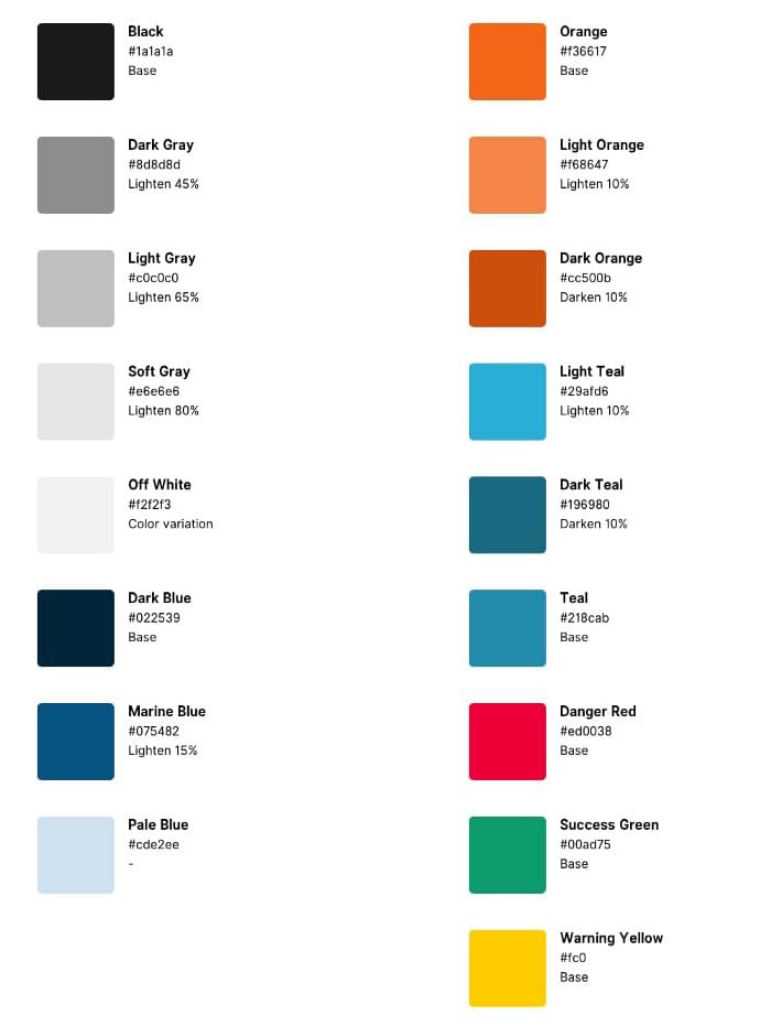
1. Set a colors palette

The first thing to do, rather obvious, will be to define a colors palette. This in fact tells us how many colors I want to use in design. But what he doesn’t tell us is how to use these colors.
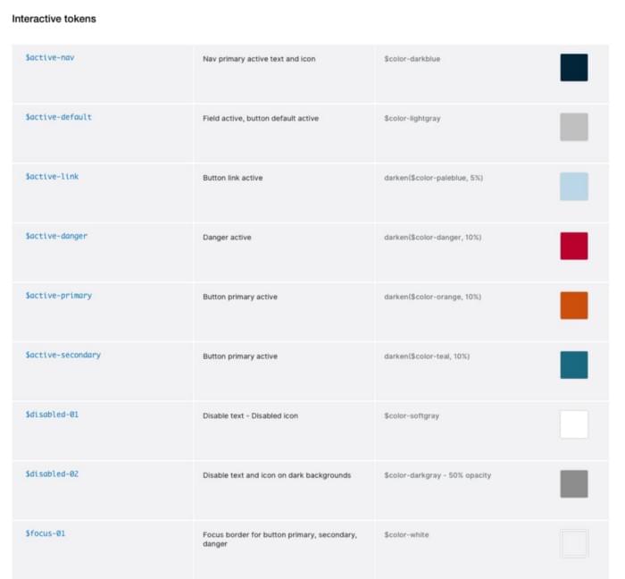
2. Interactive tokens
These are the tokebs dedicated to interactive states of the elements of an interface, such as hover, active, focus and disabled. Even in their case the same rules that we saw before apply, that is, we can use the same color as many times as we need.

Type tokens
A single type-token is defined by four properties:
- Font family
- Font size
- Font weight
- Line height

Each different combination of each of these properties represents a different token. The name of the type token is made up of 3 elements:
[type-token-name]-[type-token-option]/[color-token]
1.Type token name
Naming things is freaking hard someone said. The choice of name is influenced by the function performed by the token in the context of the interface we are designing. Recently I happened to use these names:
- body - for medium length texts, dedicated to body copy;
- label - for short texts, generally composed of a single word, used for form components, buttons and the like;
- caption - for medium / short length texts, they can be information to support other components;
- helper - for short texts used for error messages, alerts, info;
- heading - for page titles, sections, widgets, etc;
2.Type token option
The type-token-option indicates by a name, a number or a letter (you choose the one you prefer) a variant of the main type-token. For example, I can have $label-01 which defines the global style for common labels and $label-02 which defines the navbar label style. The two tokens will share some properties such as font-family and font-weight, while the font-size and line-height will change.
3.Color token
They are the ones we saw at the beginning of this article. Just associate the tokens to create all the variants we need.
The end result will look like the following:
body-01/global-color
body-01/global-inverse-color
body-02/global-color
label-01/global-color
label-02/global-color
Sass tokens for front-end dev
A simpler approach involves the use of tools such as Invision or Zeplin as communication tools between the designer and the developer. Wanting instead to adopt an advanced approach we can decide to export our tokens in JSON or YAML format and generate map files, variables in .sass usable for CSS (there is an app that does it, it’s called Theo and has been developed from Salesforce).
Insights
Receive an email whenever I publish a new article or post news about my work
